"Aesthetic" font choices lean quieter than "cool" ones — thin strokes, small caps, soft script, and generous spacing instead of heavy bold. The goal is a bio that feels curated rather than shouty. Here's a working set of styles plus real layout examples you can copy directly.
The core aesthetic style set
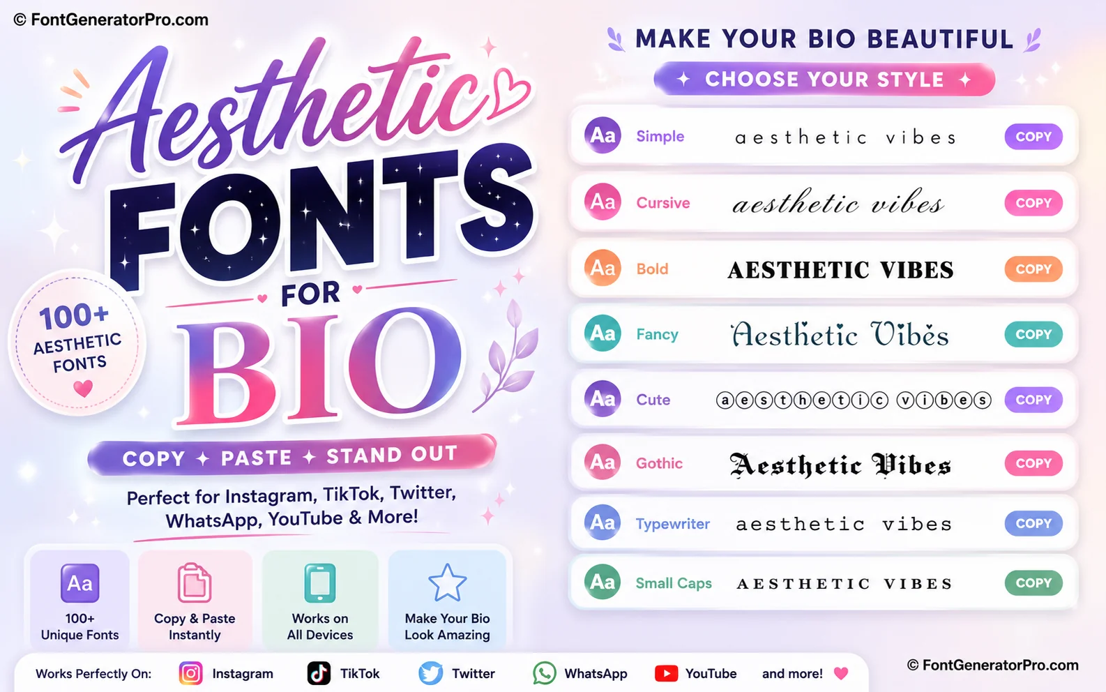
| Style | Example |
|---|---|
| Small Caps | ᴀᴇsᴛʜᴇᴛɪᴄ |
| Light Italic | 𝘢𝘦𝘴𝘵𝘩𝘦𝘵𝘪𝘤 |
| Thin Script | 𝒶𝑒𝓈𝓉𝒽𝑒𝓉𝒾𝒸 |
| Fullwidth (spaced) | aesthetic |
| Superscript | ᵃᵉˢᵗʰᵉᵗᶦᶜ |
Minimal dividers and symbol accents
Aesthetic bios lean on quiet symbols rather than emoji-heavy decoration: ˚ ༘ ⋆。˚ — ⊹ — ✧˖° ࿐. A single symbol pair framing your name is usually enough — stacking several tends to look cluttered rather than curated.
Three ready-to-copy bio layouts
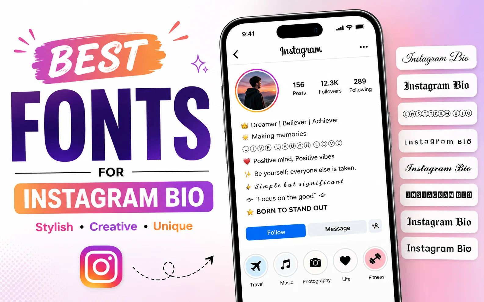
ᴍɪᴀ ⊹ 𝘱𝘩𝘰𝘵𝘰𝘨𝘳𝘢𝘱𝘩𝘦𝘳
based in seoul ˚ ༘
𝒶𝓊𝓇𝑜𝓇𝒶
˚₊‧ writer & dreamer ‧₊˚
alex
✧˖° digital art & soft things
Keeping an aesthetic bio readable
- One styled element at a time. Pick either your name or your tagline to style — styling both competes for attention.
- Leave breathing room. Line breaks do more for the "aesthetic" feel than extra symbols.
- Keep contact info and links in plain text so they stay tappable and legible.
Try it in the font generator
Type your text once and preview every style from this guide side by side.
Open the Font GeneratorFrequently asked questions
What makes a font "aesthetic" versus just "cool"?
Aesthetic styles tend to be thinner, quieter, and more spaced out — small caps, light italic, and soft script — built to feel curated rather than to shout for attention the way heavy bold or gothic styles do.
Do aesthetic fonts work the same on Twitter/X as Instagram?
Yes, since both platforms display standard Unicode text, the same copy-paste styles render consistently across Instagram, TikTok, and Twitter/X bios.
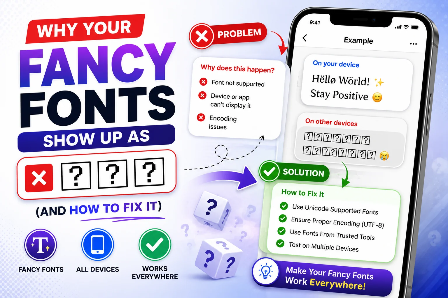
Why do some aesthetic symbols not show up on older phones?
Some of the smaller decorative symbols come from newer Unicode blocks that older devices haven't been updated to render, so they may appear as blank boxes on older hardware.
How do I keep an aesthetic bio from looking too plain?
Use spacing and one or two well-placed symbols instead of styling every word — a single soft divider and one styled name usually reads as more intentional than a fully decorated bio.
Can I use aesthetic fonts for a whole caption, not just a bio?
You can, but thin and light styles get harder to read at paragraph length, so it's best to reserve them for short lines and keep longer captions in plain text.